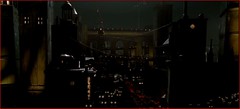
The never dull Chris Stangle recently pointed out the odd similarities on the cover designs of Criterion's new release of Two Lane Blacktop and a recent Bergman set. I'm always up for any discussion about Criterion's cover designs, because they're pretty much the best in the business (in addition to the actual DVDs they contain) and almost never ordinary. I'm a self confessed cover art snob, and I'm continually fascinated about this cult that I belong to. What is it about cover art that turns normal people into cover art snobs?
I read about DVD technology long before the first discs were released, and couldn't believe all the features they would bring home for cinephiles, but I don't think anyone predicted that DVDs would usher in a golden age for cover design. In the same way that album cover design fell by the wayside when vinyl gave way to cassettes and CDs (with their tiny canvases), the enormous value of DVDs as a product to be purchased (and not just rented) means consumers now value how their movies look from the outside. It wasn't always this way for DVDs, I remember the first cover design that really intrigued me was the Boogie Nights New Line Platinum edition. It had radically original cover art, on a slip cover that housed even more of the garish 70s design on the digipack inside. The simple jewel case long ago gave up the stranglehold on DVDs, and now we have designs on cardboard, plastic and even metal.
The Criterion Collection has always presented top quality DVDs, but it has also striven to have high class cover art -- and it hasn't always succeeded. The look of Criterion has evolved over the years, culminating this year with a homologous spine and logo treatment (the crescent "C"). Here's my list of Criterion's best covers, followed by five of their worst:
The Masterpieces
10. Days of Heaven (No. 409)
 I just love this picture -- I would put it on my wall if I could. This is a great simple design, because it's an image that you would instantly recognize from Days of Heaven, even without the text. The size of the title is also perfect, avoiding being dominant over such a great image.
 Effective understatement, for a movie that is always over the top. This cover really stands out, and the color choice is almost exactly what Verhoeven uses throughout his ugly future Detroit.
 One of a handful of iconic shots from M, heightened further by an excellent design. Enhancing the "M" on Peter Lorre's shoulder is an easy choice, but the execution is flawless, as the effect doesn't look hokey.
 While the cover is certainly good, it's the whole package that really grabs you: the discs are housed inside a BetaMax-like package that has "videodrome" written on the spine and "long live the new flesh" on the face. It's an awesome concept, and mine sits on the shelf sans the outer covering, as it really does look like one of Max Renn's videos.
 I don't care for the movie, but the cover is truly striking. It's also nicely packaged, with Walter Tevis' original novel reprinted specially for inclusion in the DVD.
 In a perfect world that title font would really exist, and I would use it for every word I typed.
 I know nothing about this movie, only that this cover truly rocks. If I could get this as a print (unspeakably large, of course), I would pay up to $100 for it. The colors are amazing, and the font is used perfectly.
I originally wasn't a fan of this cover, but after holding it and exploring all the fun stuff it contained -- I was hooked. The cover is brash and makes no apologies, plus it works like the vinyl cover of Led Zeppelin III, with those holes on the front making it possible for multiple cover possibilities.
 No image (or words for that matter) can adequately represent Tati's masterpiece, but this comes pretty darn close. Like the movie, it's wild with many planes of existence, and presents itself with no explanation.
It doesn't get any better than this for me. This is just everything you would want in a DVD cover: it's bold but also understated, and plays off one of the movie's key plot points without really giving it away. It would have been easy to put Carey Grant along with Ingrid here, but the black space is very effective.
5. Eyes Without a Face (No. 260)
 This should be a great cover, but I just can't get past the awkward use of the title -- is it supposed to look like her mouth?
 This design is a little too ambitious for its own good. There's about five different elements gasping for attention here, and why the "A David O. Selznick Presentation"? Criterion usually omits such text, for good reason.
 They picked a great image from the movie to use, but what's with the romance novel font and size of the title? This is one DVD that's begging for one of Criterion's recent re-releases, as this one is non-anamorphic and largely extra-free. I'm sure a re-release would have a much better cover.
 Okay, the title looks cool, but why are we looking at the two main characters? It's a cop-out design, that has nothing to do with the movie. It also fails to convey any of the urgency and suspense that fills this classic. This was also put out during Criterion's habit of using small type on the spine, exacerbated this time by using a brown font against a black background, making it legible only from close range.


9 comments:
I think you are spot on with the choices of M, The Man Who Fell to Earth and Notorius.
I actually like the cover for Eyes Without a Face, I found the image so creepy that when I had it out I had to turn it rightside down so I didn't see it.
I believe the writing of the title is to give the impression of the roundness of the face, however it does break the first rule of design : clarity.
Fine choices all. The cover for PICNIC AT HANGING ROCK, an early CC DVD title (Spine #29?), is a throwback to how Criterion designed the majority of their laserdisc sleeves, with a recognizable still against an austere background, and the title. That design sense (simple, but un-lovely) carried over for awhile, and you can see it on the early David Lean titles, WALKABOUT, SEVENTH SEAL, NANOOK OF THE NORTH, etc. Which doesn't mean it doesn't suck, but might be why it sucks.
I'm with you on the DAZED AND CONFUSED package, which looks gimmicky and cute until it's in your hands - where it's gimmicky and perfect.
I still don't think Criterion ever outdid their beautiful CHILDREN OF PARADISE packaging, or under-did as badly as the MOST DANGEROUS GAME. That thing's a disaster area.
To put forth the unasked question, why have studios never treated home video packaging like album covers? I understand the hard-sell approach to modern ugly poster design, where a big fat picture of Vince Vaughn's face is the entire image, but I wonder if they'd sell just as many - or more - silver discs if packaging was extension of the art they're pushing. It works for records, right?
I couldnt agree more on most of the choices except for Rebecca being # 1 and the slag off on Eyes Without A Face. EWAF I find striking and fitting to the "flashy" grain of the film. The typography evokes the twisted nature of the flick whilst alluding to the feeling of veins and such. Its challenge in reading is also a huge plus for me only leading to an ilusiveness.
Rebecaa to me is so dull. Not that I am anti minimalism are strong simple statements. I think its just the basic sans face that is what makes it fall. It could of been so powerful, but that font makes it look almost like a default. There was so much care taken into the pic placement and the tones of the black. Perfection. Then the font just destroys it. Its too basic.
CHRIS
As someone who works as a DVD pkg designer at another company, it is really hard to do anything remotely interesting. One will present ideas only to the comments "I CANT TELL WHAT THATS ABOUT" and "MAKE SO AND SOs NAME BIGGER" and "WE NEED A QUOTE ON THE COVER! I CANT TELL WHAT THIS IS ABOUT WITHOUT A QUOTE" etc. Basically its if you cant get the entire story obviously while passing it in Costco, they dont want to have it. Frustrating yes. For some reason, most DVD places hate Criterion. Mine does. Obviously, a bit o' jealousy.
ok im crack. I wrote Rebecca for some reason when I mean Notorious. I need my coffee
Thanks for the interesting comments Joe, your profession certainly gives you a unique perspective. I can understand the Notorious font complaint, but I love the red/black contrast and how the title sticks out without being dominating the design.
And I hate quotes on covers as well, hard to imagine that they would make or break the purchase.
Another perspective on Chris' comment, could it be that musical artists historically have more input on covers than filmmakers?
I don't know if it makes more or less sense but I remember in the commentary for The Most Dangerous Game that Bruce Eder says some shots of the shark attack were shown in negative in some early prints. The shots are in positive in the film itself but I did wonder whether the cover being a negative image was meant to connect to that comment.
Either way it is a bit obscure! (Though I like it!)
Late to the game with this, but I always had a love affair with (in no particular order):
1. Spartacus--Saul Bass's design is perfect. Much better than the mass market dvd.
2. The Vanishing--once again less is more.
3. Bob le flambeur
4. Jubilee--Punk aesthetics work for a punk film. simple.
5. The Battle For Algiers--Obvious Muslim imagery+struggle imagery.
6. My Own Private Idaho--The packaging is actually what does it. Its beautifully presented.
7. Sweet Movie--The cover for such a experimental film needs an equally as audacious cover.
8. Mishima: A Life In Four Chapters--this is actually my favorite of the moment. I would take a poster of this in a heartbeat.
9. Ran--I really like the primary color splotches on the cover and then the bold lettering of RAN.
10. The Discreet Charm of the Bourgeoisie--First Criterion cover I saw and I'm still intrigued by it.
The only that I have watched from the master piece list. It is Robocop that it was amazing. Specially for that time.
I think RoboCop (No. 23) has the best cover design of all time... I know the other covers you mentioned are good, or at least most of them, but this one has something special, a "plus", and safemeds magazine thinks the same, check it out.
Post a Comment